Empowering Sustainable
Food Choices
.png)
Client:
McMaster Hospitality Services
Timeline:
4 months
Tools:
Figma,
Figjam
Team:
ProductsDesigners & Engineers
My Role:
UX/UI Design & User Research, User Testing
Brief.
Label and mobile app to empower users to make more sustainable food choices.
We developed a sustainability decision-making tool for students through a product label and interactive mobile app, designed to provide users with instant, real-time information about their food choices and the ecological impact of their consumer behaviour. By scanning the label's QR code, users can easily access sustainability details, helping them make more informed, environmentally responsible decisions. This solution empowers students to track their sustainable habits and raises awareness of their ecological footprint, encouraging positive behavior change toward a more sustainable lifestyle.
Problem
Many students face eco-anxiety when trying to make sustainable choices.
There is a growing interest in sustainability, particularly amongst the younger generations. Many students are aware they should make more sustainable food choices, but experience eco-anxiety. In other words, even when students with an interest in sustainability and environment actively look for ways to reduce their foodprint they are often overwhelmed with which decisions to make day to day in order to feel like they have made positive change. More often than not, they do not know HOW TO as discovered from our research and user interviews. Hence, we wanted to explore ways to help students choose more sustainable food options on campus.
Design Challenge
Explore ways to help students choose more sustainable food options on campus.
How Might We help environmentally conscious students make sustainable food choices and be able to identify the different sustainable food choices available for them?
Solution
Empowering students to make informed, sustainable food choices with a simple scan.
The resulting solution is a Sustainability Value Label with QR code that serves as a secondary information medium through which users can get more related sustainability information about the particular food item they purchased.
The sustainability information is designed using personable and relatable information that help users make sense of how much their purchase would impact the environment in an easy to digest and understandable way.
Here's a closer look; (or scan the QR code and interact on your own screen!):


The Research
We spoke to a total of 12 stakeholders in user interviews including students and experts to get a deeper understanding of what sustainability means to people, how much they care about it and their experiences with making the conscious effort to eat sustainably. We also did ethnographic field research, observing students in their daily routine, documenting their habits and choices through out the day, especially when making choices around buying food on campus.
-
Inclusion criteria for target users: Students who had interest in sustainability and but may face challenges in food choices on campus.
The strategy to conduct these interviews involved reaching out to relevant student groups and organizations, as well as using social media platforms to recruit participants. The interviews provided valuable insights into the students' understanding of food sustainability and the barriers they face in making sustainable food choices. Overall, the interviews were a key part of the research process and helped to inform the development of the sustainability value label product.
Many of our users cared deeply about making thoughtful choices when it came to food consumption. I'd like to share a few key quotes from the interviews that stood out to me that illustrate this:

Secondary Research
After conversing with these students, we discovered that several of the participants had a limited understanding of the practical application of food sustainability and sustainable diets. Our secondary research further substantiated this observation. Although over half of the university's students, staff, and faculty considered food sustainability, only a small proportion of them believed it was difficult to adopt a sustainable diet, with the vast majority claiming to only consider it occasionally.
Results showed that:

The Process
-
We followed a Human-Centred Design Thinking approach, employing Empathy not just at the beginning to understand user needs and problems, but also through out our process to ensure iterations were based on real user insights.
-
We interviewed 8 participants including Students, Sustainability Experts, Community Engagement Coordinators, as well as Instructors.
-
We also went out in the field and did ethnographic field research, observing students food choice and spending habits on campus.
Initial Findings
Initial Findings helped us understand and define the problem area better as well as develop our user persona to make out current student experiences around decision making processes for sustainable choices. Here were a few key major findings in our initial phases of interviews:
-
It’s easier to make sustainable food choices when you already care about the environment
-
Buying food is a decision with many competing factors (price, nutrition, taste, and size) and individual value systems drive purchase decisions.
-
Too much information can be overwhelming and not enough can leave them with more questions.
-
There’s mental health and eco anxiety around Individuals who are working really hard and thinking about 'living more sustainability', may get overwhelmed or pessimistic, and that can potentially reduce their ability to contribute.
-
Another major finding we discovered is that a barrier to wanting to incorporate sustainable habits into lifestyle is a lack of personal connection participants sometimes felt to their conscious habits.
Who is the User?
Having spoken to a variety of students, we decided to target students who are already environmentally conscious or have minimal knowledge but care about their impact. Primarily because, we discovered that it’s easier to talk about sustainability and be devoted if it’s something you already care about.
To get into more specifics and further identify the need space based off our interviews, we defined a persona that defined the key characteristics and motivations of who our ideal user is.

Current Experience
To identify the motivations behind users’ food choices and buying process, we used a journey map to highlight the various touch points and interactions involved in the current decision making process of buying food on campus.

Key Insights & Opportunities
Based off the interviews conducted, we identified common themes in user stories and used that to identify areas of opportunities which informed our project’s direction.
After we generated key insights by interviewing our users, we started to narrow and define our scope as it related to sustainability and food choices. We did this through User Need Statements, to help define and align on the problem we were going to solve.
There many different areas and directions we could pursue, all of which work together to achieve a very similar and common goal. Although considering each of these different parts and factors contributes to the strength of the project, it also leads us down the road of complexity. Hence, the need to narrow down to a particular scope.
User Need Statements also helped us capture what we wanted to achieve with our design, and set the stage to help us brainstorm and ideate.


Defining and Narrowing Scope

Evolution of Ideas through Prototyping & Iterations
We started brainstorming various concepts we could explore as possible solutions to the identified opportunities.
Using User Research to Guide Ideation:
-
We knew that there were layers to the solution we had to consider: Understanding what sustainability means when looking at a food item, Understanding how to make sustainable food choices, as well as, tracking long term habit tracking and positive reinforcement.
-
Thus, we decided to incorporate Multi-Layer Engagement for our prototype.
Exploring Initial Concepts through Moodboard
To help visualize some of our ideas and types of engagement we wanted, we used a mood to help us brainstorm. One of the key aspects of this moodboard was tracking someone's "foodprint" similar to the metaphor of a carbon footprint.
Initial Prototype:
-
Description:
'Value Label' placed on Food Products with QR Code. Designed to provide information on Sustainability Facts via Phone. The QR code has Infographics with detailed statistics and references related to sustainability.
-
Feedback from Users:
"I think it is really valuable to have a clear and simple label directly on the package. It would definitely influence my purchase decision and make me aware of product sustainability."
"Companion would be great to find out more information"
"It would be good to see clear understandable metrics to provide legitimacy to the label"
In summary, based on the feedback received from concept lo-fi prototype testing and analysis, we decided to further develop the label but create more variations to consider some further feedback.
-
Students liked interactive component from all the concepts, so good idea to keep this theme for future prototypes.


User Testing & Iterations
User testing and gaining valuable feedback from our users was done through out our process to ensure iterations and design decisions were based on real user data. Our User testing involved Mid-fidelity prototype testing and validation. Here were a few of the iterations based on the feedback we received. You can see how our prototypes involved based on user testing:
Iteration: Adding a 'Sustainable' Symbol
Description: If food item meets threshold for McMaster sustainability goals and metrics for selected ingredients, packaging, and sourcing, it would ideally receive a symbol to mark this. The symbol is used as a symbolizing image of Green Food Initiative and a sustainable food item. It is designed to capture a user’s attention at first glance with an icon representing Food(carbon)print and a short message around the icon showing what impact the user’s purchase could have on the environment.
Feedback:
-
"Having a symbol is a good way to make the initiative sear into people’s memory for recognition purpose."
-
"But it would need to convey a little message that makes them curious and aware that this is sustainability related."
-
"The arc’ed message format is rather stressful because I’d have to tilt my head to read that."
Iteration: "Food"print Infographic to enable better Understanding of Sustainability
Description: After scanning the QR code on the food item, the user will be redirected to a webpage which gives more detailed information about the specific purchase item, and a reference to real-life impact of what that means in terms of their carbon foodprint (C02 emission amount). User can add the food to their log, which will aggregate data from food they’ve added for review
Feedback:
-
"I like that the information is specific."
-
"Maybe help users see how their choice/purchase compares to other available options. This way, they make better sustainable choices next time since they can already tell which purchase is more sustainable."
Iteration: Adding Personalization so Students can 'Connect' with Sustainable Habits
Description: FoodPrint Profile allows webpage information page a user is redirected to after scanning the QR code on the food item. The page shows the user’s sustainability purchase number collated over a period of time.The numbers reveal the total calculated amount of C02 emission the user’s purchase is equivalent to and uses a comparison message to help the user make sense of what that CO2 equivalent means in relation to everyday things in the user’s life.
Feedback:
-
"The comparison message has to be related to general knowledge. Some people might not be familiar with barrels of oils except they work in the oil industry."
Summary of major feedback: Imagery/Symbols are powerful in grabbing initial attention, but can be refined - simplify and remove unnecessary information, Combination of concepts with more relatability.
Based on this feedback and analysis, we decided to take our testing a step further to run a mini-pilot with other students.


Pilot Testing
After a receiving feedback on our iterations, we ran a pilot testing session on the physical and digital prototypes.
We felt it was imperative that we make all three of our final prototypes into real tangible physical and digital models that McMaster students could interact with. We printed each label and attached them to standard McMaster sandwich boxes. The QR codes on each label were scannable and linked to our various app designs. Lastly, we create a miniature poster that gave a explanation of our re-imagined solution. These prototypes allowed us to create a mini-pilot where we were able to test our various solutions with multiple students. From this we were able to gain valuable feedback for our final solution.
We tested the visual impressions and information relevance with some students. Some of the feedback received include:
-
The checkmark is more attracting visually, gives instant gratification about the product. But the information below is rather too much for consumption in 10secs of grabbing purchase.
-
Exploring other colors with good contrast will make the medal the most preferred choice.
-
Add green circles to the medal, (more circles means more sustainable) to give it a more sustainable feel.
-
The QR code alone suffices for secondary information. People are more visuals-oriented than text-oriented.
Here are some of our users interacting and engaging with our prototypes!


Resulting Prototypes
The final solution is a Sustainability Value Label with QR code which can be scanned for more digital information After several iterations and user testing and feedback gathering, we were able to come up with a simple but impactful label that helps students make sustainable food choices at the point of purchase. Further to that, students can also learn more about the quantitative impact of the food item purchased in a way that makes sense to them.


Re-Imagined Experience
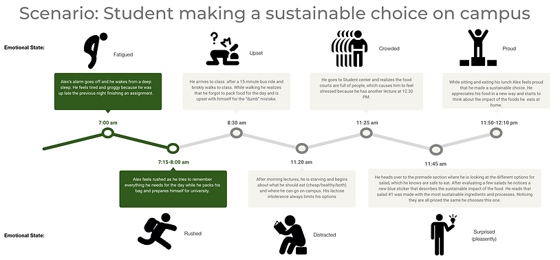
Here’s the re-imagined experience of our target users, environmentally-conscious students after using this solution.
Comparing Before and After Journey of Users' Decision Making Processes:

The Impact
This project allowed me to create solutions that had the potential to influence everyday decision-making through thoughtful design. Here are a few key highlights of the impact of the work:
-
Delivered high-quality presentations to stakeholders, showcasing a polished prototype to a panel of design experts.
-
Earned the opportunity for consultation with retired OCADU design professor, further validating the project’s potential.
-
Expanded my professional network through engagement with design professionals and stakeholders.
Reflections..
This project challenged me to think critically about how sustainability is often a luxury for many communities. It reminded me that empathy in design isn't just about creating eco-friendly options but understanding the realities of those who can’t always prioritize them. True impact comes from creating solutions that are inclusive, accessible, and realistic for all users, not just the privileged few.
I also came to realize that collaboration is the key to unlocking innovation. Working alongside a diverse set of individuals, expanded my perspective. The project showed me that great design emerges from shared knowledge, and that the best solutions come from harnessing collective expertise and communicating across disciplines.
And finally, one of the most profound lessons was the importance of digging deeper during user research. Surface-level insights rarely capture the full picture. Through follow-up interviews, I learned to appreciate the complexities behind human decision-making. Understanding those deeper motivations helped us build a product that resonates on a meaningful level, ensuring that people, not just prototypes, remain at the heart of the design process.