Designing the Future of Hospital Rounds
Client:
St. Joseph's Healthcare Hamilton
Timeline:
8 Months
Tools:
Figma,
Figjam
Team:
UX Designer & Software Developer
My Role:
UX Design & UX Research
Brief.
Tool for Bridging Communication Gaps and Capturing Patient Insights, ensuring critical information doesn't fall through the cracks.
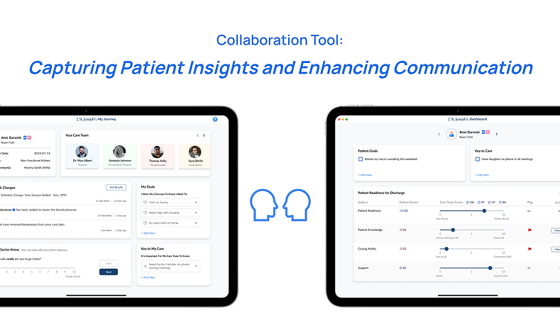
Our resulting prototypes from the iterations is a Two-Way Platform for Patient-Care Team Collaboration, featuring a Patient-Facing View and a Care Team-Facing View. The platform aims to bridge the gap between patient and care team insights, where data serves as a dynamic dialogue between the two interfaces, fostering real-time communication and collaboration.
Problem
How do we bring the patient’s perspective into Clinical Meetings?
In the fast-paced environment of Rapid Rounds, healthcare workers assess and prepare for patient discharges, often lack a key element: the patient’s voice. Despite the efficiency of these meetings, patients’ perspectives are not consistently captured or conveyed.
Currently, there’s no structured way to document patient insights at the hospital, and existing workflows make it difficult to integrate patient input without overburdening the staff. As a result, important insights from patients may be overlooked, leading to fragmented communication and delays in care. This further leads patients to feeling like they are passive participants in their care journey.
Design Challenge
Re-imagine what it would look like if patients and clinicians were collaborators in patient care. Where there is true communication and meaningful dialogue, and where patients can be active participants.
For Patients: How might we ensure patients feel heard and connected with their care team, and hospital journey?
For Healthcare Workers: How might we enhance communication and connection between healthcare workers and patients, without overburdening their workload?
Solution
Capturing patient data in a matter of seconds, and relaying back to healthcare teams in meaningful metrics.
Two interfaces communicate: data flows between the two views, acting as a dialogue. This approach aligns with our design challenge of creating a solution that fosters meaningful communication, where patients are not only informed but can actively participate in their care.
Here's a closer look of each Interface:
Patient View: Solution equips patients with a comprehensive overview of their care, allowing them to view real-time updates on medical changes, set and communicate personal goals, and inform their care team of critical needs through features like "Key to My Care." It also enables patients to give direct input about their discharge readiness and level of understanding through the "Let Your Doctor Know" feature, while clearly displaying the care team members responsible for their treatment, fostering better communication and collaboration.
Healthcare Worker View: Provides a comprehensive view of patient data for the care team during rapid rounds, including visual metrics for patient voice represented through scores that can be viewed at a quick glance, personal goals, and key to care preferences. It uses a clear, scalable system to highlight critical areas like patient knowledge and coping ability, allowing for immediate follow-up and ensuring that patient insights and preferences are not overlooked in clinical decision-making.



The Research
How did we arrive at this solution? Through Design Research! We went out in the field and did observations as well as conducted 14 user interviews, including both user testing and semi-structured interviews during the Ideation and Prototyping phases. This research helped us gain deep insights into patient experiences and the roles of care team members within Rapid Rounds.
User interviews during the Discovery & Define Stages helped us gain a clearer understanding of the problem, while interviews in Develop & Deliver stages allowed us to refine our ideas and integrate essential stakeholder feedback. Even so, our process was non-linear and insights from even Stakeholder Feedback of our prototypes helped us uncover new insights to help better define our problem. In this manner, our process was highly iterative. The following table outlines these research methods used and the deliverables produced in our process:


The Process
-
We conducted the user research by first screening out ineligible participants. We provided participants with a consent form which they needed to sign to participate in the study.
-
The usability tests and interviews were conducted online.
-
The data from the research was analyzed and organized using an affinity diagram and an empathy map. These artifacts helped our team understand the participants thoughts and pain points. It also helped us collaborate & organize our key findings, observations, and direct quotes gathered from interviews in clusters as shown.

Key Findings
We uncovered several key insights and pain points, which we then organized into major themes and clusters as shown below.
-
Identified pain points associated with communication challenges and patient and health care team interactions.
-
Uncovered valuable findings from observations and interviews which revealed that while first hand accounts of patient insights were missing in clinical meetings, the insights that patients depended on others to relay (social workers, occupational therapists, and others), were often being overlooked in the rapid pace.

Connecting User Needs & Insights
We created User Needs Statements because they allowed us to connect user needs with key insights, helping us clearly articulate the core problems and opportunities.

Who are the Users?
The scenarios we explored, combined with our interviews, observations, and insights, helped us identify the key characteristics of the primary players involved in our problem. To refine this information into a clear, actionable format, we created User Personas. These personas allowed us to define key characteristics of primary stakeholders in a structured, easy-to-understand way to present these challenges, highlighting their key needs as well as frustrations with current systems and interactions.


Current Experience
Taking the user personas of Amir, the patient, and Sana, the social worker, I created an illustration of a typical current experience and interaction at the bedside and during rapid rounds. This storyboard synthesizes our research findings into a visual format, focusing on patient's journey through the healthcare system. It captures the key moments, challenges, and emotions that define his experience, providing a clear and relatable depiction of the issues we aim to address.
Visual narrative helps stakeholders quickly understand the core problems and areas of concern, making it easier to identify opportunities for improvement and to develop targeted solutions that accurately meet user needs in the subsequent stages of the project.


Our interviews and observations uncovered that for patients, having a voice means more than just the ability to relay preferences or inquiries; it involves having their sentiments acknowledged and truly listened to by the healthcare providers they trust.
This helped us refine our Design Challenge as presented earlier, where we aimed to create a space where true communication and meaningful dialogue occur, allowing patients to be active participants in their care.
Evolution of Ideas through Prototyping & Iterations
Below, you can see how some of our initial ideas evolved through feedback and collaboration, highlighting the iterative nature of our work. As we conducted more interviews, we continuously refined and reframed the problem, ensuring that our solutions addressed the right challenges. Feedback from IT specialists during this phase, and in later stages, also helped us assess the feasibility of our solutions.
Iterations below were for the patient facing interfaces, which were based on the feedback gathered from those who knew patients the best: the patient themselves, their family, volunteers, and healthcare workers.


The other side of the story was how this data would get to health care workers in their rapid clinical meetings. We knew for our solution to be impactful and for patients voice to be truly 'heard' the data needed to captured and displayed in meaningful ways for health care teams. Remember, a key pain point for these professionals is that they are already burdened with tasks so reducing input and click fatigue was critical.
Below are iterations for healthcare team facing interface:


User Testing
User testing and gaining valuable feedback from our users was done through out our process to ensure iterations and design decisions were based on real user data. We sought qualitative data to uncover the reasons behind specific user behaviours and responses as they interacted with the prototype. By observing and actively listening to users, we were able to gather their opinions, feedback, and potential difficulties they encountered while using the system.
-
We conducted Moderated User Testing using semi-structured interviews and observations.
-
9 Participants were involved in user testing including: Patients, Volunteers, Healthcare Staff.
-
At this stage we were also interested in figuring out how the two solutions could work together and compliment one another.
Design Decisions based on User Research
Key insights and findings from user testing helped us make informed design decisions for our 'final' iterations. Here are a few of those feedback we received that we implemented and we heavily considered during iterations:
-
Simplify language - Patients found the language too clinical, so we replaced medical jargon with more accessible terms and softer words.
-
Reducing information fatigue & Accessibility considerations - Patients with dexterity and vision issues struggled with typing, so we minimized text input and added one-touch response options..
-
Balance digital and verbal communication - Reducing amount of text being read and inputted, use visual cues and touch input, still allowing verbal discussions which was key user need on both sides.
Based on this, let me take you through how we implemented these and other feedback considerations into our final design features.
For Patients & their Families:
Updates & Changes feature provides clarity and transparency about clinical decisions being made to the patient. Equips patients with better understanding of their health and care journey.
Patients can communicate with their Care Team Easily - Feature that Provides autonomy, allowing patients to provide input, and relay information directly to doctor during Rapid Rounds, increasing active participation in their care.
Patients can add Goals that matter to them. Helps provide context to patients goals for care teams. Allows patients to communicate what is meaningful to them in their words, enabling a more collaborative approach.
Patients or their families can enter critical information for their care, displayed beside bedside and in clinical meetings which allows clear communication for entire care team through documenting key patient insights. Gives personalized attentiveness where patients feel their voices acknowledged.
Putting it together: Prioritized interface features for patients and families based on their needs.
Solution provides patients with real-time updates, goal-setting, and direct communication with their care team. Features like "Key to My Care" and "Let Your Doctor Know" enhance collaboration and discharge readiness.
For Healthcare Teams:
It was important to consider now the other side of the coin and how will information from the patient's bedside be transferred to the care team interface in a seamless and efficient manner? To meet user needs in clinical rounds solution had to be:
-
Quick and Efficient (can be looked at spoken about in less than a minute)
-
Few words as possible, reduce need to input and read text
Patient Insights Scales provides holistic understanding of the patient, giving documented insights beyond medical info, facilitating clearer communication amongst team members during rapid rounds.
Patient goals integrate their perspective into decision-making, helping clinicians focus on what matters to them during bedside interactions. Key to Patient Care ensures critical insights aren’t overlooked, promoting clear communication and consistent care, enhancing trust between patients and care teams. These are inputted outside of rapid rounds and critical to discussion, allowing decisions and follow up tasks to consider key information.
Putting it together: Interface features prioritized for healthcare workers in rapid rounds meetings.
Comprehensive view offers quick-glance visual metrics of patient voice, goals, and care preferences. Highlights critical areas like patient knowledge and coping ability, enabling immediate follow-up and ensuring patient insights aren’t overlooked in decision-making..


Re-Imagined Experience

I chose to represent solutions through storyboards to visually demonstrate how key users - such as patients and care team members - would interact with the features in real-world scenarios. Storyboarding allowed us to clearly illustrate the impact of the solutions, highlighting the moments where critical information is shared, decisions are made, and patient needs are addressed.
(Swift through the storyboard by clicking the arrow buttons).
The Impact
My team and I presented our work to hospital leadership and stakeholders at St. Joseph's Healthcare Hamilton, Innovation Tower. They were not only impressed by our solutions but also how well we captured the problems and presented our design decisions. Here are a few of my favourite comments we received:
-
"It's very validating to hear exactly what we think the problem is, echoed back to us in a really clear way, because it gives us a lot of faith in your solution."
-
"You've done a really good job of translating the stories into an actual tool we can use to solve that problem."
-
"As a family member of a patient in this hospital, I would love to have this tool."
Testimonial from one of our Project Leads:
Our work also earned us a spot in the Health Innovation Bootcamp - an ongoing opportunity to pitch our idea to eager investors.
I had so much fun presenting and participating in meaningful conversations about our work!


Reflections..
I have been inspired and honoured by the stories of patients, volunteers, and healthcare workers.This experience taught me the power of listening, and that innovation isn’t just about creating shiny digital tools - it’s about people. When you truly listen, that’s when meaningful change happens.
So, one of the most valuable lessons I am taking away from this experience is to make people, not prototypes, the heart of your process. Our design process thrived on continuously learning from users and refining our work based on their needs.
I also had the unique opportunity to collaborate with diverse set of individuals - including IT specialists and developers, which also taught me the importance of collaboration and working with teams and the wider organization to understand business needs + communicate ideas in ways diverse set of audiences can understand.
